Power Point Feeling
As a university student, we basically will use and look different kinds of power point everyday. Some of them are beautiful but some of them are quite boring. When I saw some complex and some “worst” slide, I feel like I don’t want to study with this kind of power point. A poorly formatted power point will make feels I lost my happy day. Power point is a really useful and convenient tool for study and earn new knowledge. Before this week’s lecture, I don’t know there are many principles that can help power point look greater and more clear. On the other hand, a great power point can shows how much time and effort was put on the power point.
Power Point Standard
Years age, when power point was just face to people, their goals are letting people can know other’s thought immediately. However, in nowadays, the internet and many technology developed so fast, people have more and more choice on creating a powerpoint. The reason why we can accept a not-great PowerPoint is because we still can understand what the writer is trying to telling us combined their speeches. For a good PowerPoint, I think we need to consider the words amounts we out on each slide, the colour should be matched for each slide and we should add appropriate images which can explain our words best.
Example of a good infographic
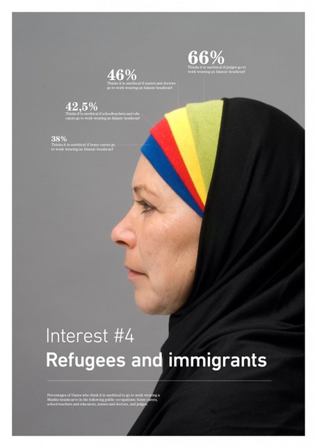
This infographic clearly showed the goal is we need to focus on refugees and immigrants. This Infographic also very attract people’s eyes as well, because the woman fills more than half of this Infographic.
A bad infographic
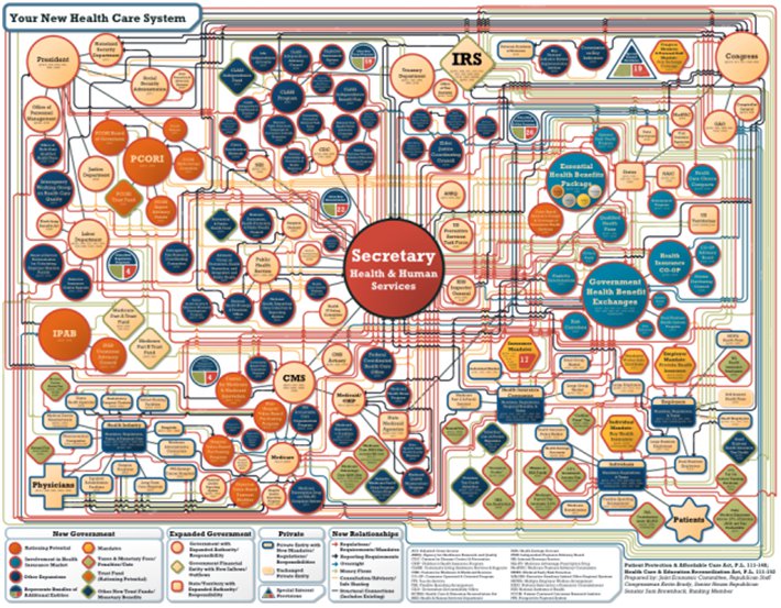
This Infographic is way to complex. Although we still can find its main point, we are not easy to get other more specific information.
Reference
Sanders, P., 10, R. on D., 10, iG. B. D. on D., 10, P. S. on D., 10, R. B. on D., 13, S. R.-B. on D., 15, J. M. C. on D., 15, iG. B. D. on D., & *, N. (2018, October 22). Infographics vs. Infocrapics: The good, the bad, the ugly. SEO.com. Retrieved October 10, 2021, from https://www.seo.com/blog/infographics-vs-infocrapics-the-good-the-bad-the-ugly/.
3 Responses
saelex
I like how you compared the infograph with a good and bad example, the 2nd one I agree is too complex. I suggest creating your own powerpoints and infographic to show the understanding of the lessons.
atomin
Hi, Queenie.
Thank you for sharing your thoughts on design principles for Multimedia presentations.
As you said in the paragraph, technological advancement has shifted how we input and gain knowledge and how we create PowerPoint diversified. It would be clear if we could see the difference between a good and satisfactory PowerPoint with an example. Although, I can imagine how it looks like in my head. The two infographics profoundly give a difference in terms of the level of simplicity in information. The second poster or illustration seems too complex and seems tedious to absorb the information entirely.
Looking forward to see your future posts.
Atomu
qixingyu
Hi, Queenie
Thank you for sharing two different inforgraphics, I agree with you how you compare them and how the second one is complex.